A cleaner approach of Storybook for React Native with Expo

I used to like Storybook for web development, but working with Storybook for React Native has been a bit challenging. Setup was tricky, dependencies were often not in sync, and the overall experience wasn’t as smooth as for the web.
Lately, with Storybook 6.5 things have been improved. Now we have the “new way”(CSF) to define stories, organisation of stories within folders and on-device addons that are pretty effective to develop and test visually UI components.
The downside is we still need to generate a file including all stories on pre-start. (Also I didn’t find any clean way to use storyshots with React Native).
Despite this drawback, considering the improvements, it might be worth giving Storybook another shot for React Native projects.
Storybook for React Native (6.5)
The approach
Some folks (including the official tutorial) seose to install Storybook directly within the project and use an environment variable to determine whether they want Storybook or the actual app. I’m not a fan of this approach for a few reasons:
- It mixes Storybook with the app dependencies (and sources).
- Switching between Storybook and the app requires restarting the bundler often with a cache reset.
- It slows down the developer when it shouldn’t.
- Why not take this chance to create the UI as a separate design system package instead?
What I’m aiming for is straightforward and manageable workspace for my project which offer a better developer experience (DevX) by allowing to develop and preview both UI and the app simultaneously. And of course I want to retain the flexibility to use my favourite solution for UI (whether it’s a styling lib or an existing design system) and for the app (Expo or a bare project).
Are you interested in? Let’s do this!
Setup the workspace
I’ll be using Yarn Workspaces to setup the monorepo.
I would prefer to use Bun, but at the time I’m writing these lines, there are still some issues when using it in a React Native monorepo.
Create a new folder for your project workspace then add at root the package.json file:
{
  "private": true,
  "name": "storybook-monorepo",
  "version": "1.0.0",
  "engines": {
    "node": ">=20.10",
    "yarn": ">=1.22"
  },
  "workspaces": [
    "packages/*"
  ]
}
Include your favorite dev tools and dependencies that will be shared by all packages. This promotes improved dependency management and an effortless way to handle upgrades.
In this example, I will only set up TypeScript and Prettier to apply code style:
$ yarn add -W -D typescript prettier
Don’t forget to define you prettier config, personally I like it in the package.json so I reduce the amount of config file in my root folder.
{
  ...
+ "prettier": {
+   "arrowParens": "avoid",
+   "semi": false,
+   "singleQuote": true,
+   "trailingComma": "none"
+ }
}
You may find my code style configuration a bit odd, feel free to set your own, but I like mine in a kind of Swift code style.
UI package
Let’s create our first package: the one for UI components and the Storybook.
I’ve choosen to use the same package for both, but you can also separate them into different packages, especially if you intend to create UI components for both mobile and web.
For convenience, and since I don’t require any native-specific configuration, I use Expo to create the Storybook app:
$ mkdir packages && cd packages
$ yarn create expo-app design
You can clean a bit the app.json file since we don’t really cares about icon and splash screen unless you want to publish internally the Storybook app:
{
  "expo": {
    "name": "design",
    "slug": "design",
    "version": "1.0.0",
    "orientation": "portrait",
    "icon": "./assets/icon.png",
    "userInterfaceStyle": "automatic",
    "assetBundlePatterns": ["**/*"]
  }
}
Storybook setup
- Add Storybook dependencies alongside add-ons:
$ cd design
$ yarn add -D @react-native-async-storage/async-storage
              @react-native-community/datetimepicker
              @react-native-community/slider
              @storybook/addon-actions@6.5
              @storybook/addon-controls@6.5
              @storybook/addon-ondevice-actions
              @storybook/addon-ondevice-controls
              @storybook/react-native
              react-dom
              native-safe-area-context
- To complete Storybook setup, create the .storybook folder with theses files:
// .storybook/index.js
import { getStorybookUI } from '@storybook/react-native'
import registerRootComponent from 'expo/build/launch/registerRootComponent'
import './storybook.requires'

const Storybook = getStorybookUI({ shouldPersistSelection: true })

registerRootComponent(Storybook)
// .storybook/main.js
module.exports = {
  stories: ['../src/**/*.stories.?(ts|tsx)'],
  addons: [
    '@storybook/addon-ondevice-controls',
    '@storybook/addon-ondevice-actions'
  ]
}
// .storybook/preview
import { SafeAreaView } from 'react-native'

export const parameters = {
  actions: {
    argTypesRegex: '^on[A-Z].*'
  },
  controls: {
    matchers: {
      color: /(background|color)$/i,
      date: /Date$/
    }
  }
}
- One last step is to change the app entry in thepackage.json in order to use our Storybook and add the prestart script to grab all stories on startup:
{
  "name": "design",
  "version": "1.0.0",
- "main": "node_modules/expo/AppEntry.js",
+ "main": ".storybook/index.js",
  "scripts": {
+   "prestart": "sb-rn-get-stories",
    ...
}
Don’t forget to ignore storybook.requires.js from Git files.
Components & stories
The Storybook configuration is complete, and it’s now time to craft the initial component along with its story.
As example, I will generate simple Title & Paragraph component using @emotion/native, but feel free to customize them according to your preferences.
// src/components/Title.ts
import styled from '@emotion/native'

const Title = styled.Text<{ color?: string }>`
  padding: 10px 0 5px;
  font-size: 24px;
  line-height: 26px;
  font-weight: bold;
  color: ${({ color }) => color ?? 'black'};
`

export default Title
// src/components/Title.stories.ts
import { ComponentMeta, ComponentStory } from '@storybook/react-native'
import Title from './Title'

const meta: ComponentMeta<typeof Title> = {
  title: 'components/Title',
  component: Title,
  args: {
    color: 'black',
    children: 'Lorem ipsum dolor dicit'
  }
}

export const basic: ComponentStory<typeof Title> = props => <Title {...props} />

export default meta
// src/components/Paragraph.ts
import styled from '@emotion/native'

const Paragraph = styled.Text`
  padding: 10px 0 5px;
  font-size: 14px;
  line-height: 16px;
  color: black;
`

export default Paragraph
// src/components/Paragraph.stories.ts
import { ComponentMeta, ComponentStory } from '@storybook/react-native'
import Paragraph from './Paragraph'

const meta: ComponentMeta<typeof Paragraph> = {
  title: 'components/Paragraph',
  component: Paragraph,
  args: {
    children:
      'Lorem ipsum dolor sit amet, consectetur adipiscing elit. Praesent ullamcorper viverra risus, quis lobortis justo euismod et. Mauris sit amet nulla fringilla, efficitur elit sit amet, mollis mauris. Vivamus neque massa, accumsan quis dignissim vel, varius in turpis. Mauris a lectus ac ipsum maximus tempus ac et est. Donec sit amet urna luctus, consequat nisl sit amet, auctor elit. Cras at tellus turpis. Aenean posuere mauris at mauris gravida, vitae elementum turpis hendrerit. Nulla tempor, justo vitae viverra vulputate, diam libero scelerisque odio, vitae egestas augue ante vitae nulla. Mauris non mauris suscipit, consequat diam eget, volutpat mi.'
  }
}

export const basic: ComponentStory<typeof Paragraph> = props => (
  <Paragraph {...props} />
)

export default meta
Run Storybook
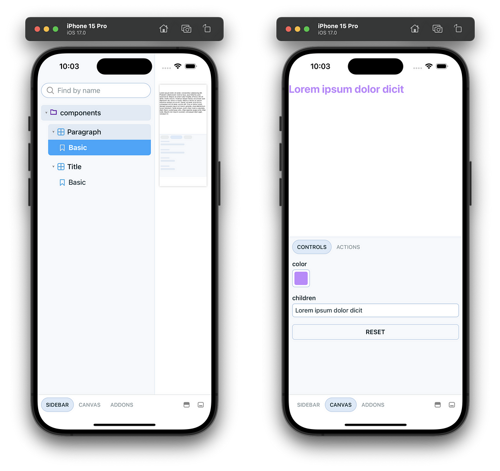
Run yarn start and you will see your Storybook app and should be able to play with your first stories:

Export components
You have two options to export your components:
- Export it from an index.ts file set in the main field in the package.json
- Import components directly from the source file (e.g. import Title from "design/src/components/Title"), which may require additional path and/or alias configurations.
In my opinion, despite the need to manually export exposed components, the first option is the better. It ensures that usage is restricted to the exposed components, creating a behavior similar to working with a third-party library.
If you choose the first option, create the new entry point file as index.ts:
// Export Storybook app entry point
export { default } from './.storybook'

// Export exposed components
export { default as Title } from './src/components/Title'
export { default as Paragraph } from './src/components/Paragraph'
{
  "name": "design",
  "version": "1.0.0",
- "main": ".storybook/index.js",
+ "main": "index.ts",
  ...
}
App package
App setup
- Repeat the previous steps (excluding Storybook) to create your app package:
$ cd ..
$ yarn create expo-app mobile
- Follow the official guidelines https://docs.expo.dev/guides/monorepos to make it work in a monorepo context.
If you intend to use Expo Router, you can skip these steps since it work seamlessly with monorepo.
Add UI package as dependency for the app package:
{
  "name": "mobile",
  ...
  "dependencies": {
+   "design": "*"
    ...
  }
}
Build your screen
Yarn Workspace already care of linking packages so you are now ready to use your components to build your app screens:
import { Paragraph, Title } from 'design'
import { SafeAreaView } from 'react-native'

export default function App() {
  return (
    <SafeAreaView>
      <Title color="purple">Lorem ipsum dolor dicit</Title>
      <Paragraph>
        Sed ac dui at ipsum dictum finibus ac ut lorem. Cras in leo id tortor
        commodo bibendum nec non magna. Praesent lacinia ante lacinia orci
        dictum, quis varius ipsum consectetur. Proin id neque eget odio pulvinar
        volutpat. Nunc ac erat et lectus ornare imperdiet ac in elit.
        Pellentesque at enim ac dolor sagittis porttitor ac at arcu. Phasellus
        in felis eu erat tincidunt commodo. Ut tellus odio, euismod eget
        placerat sed, sagittis in libero.
      </Paragraph>
      <Paragraph>
        Praesent iaculis fermentum commodo. Praesent lobortis est augue, in
        mattis eros ultrices sit amet. Proin pharetra hendrerit odio, vitae
        eleifend libero placerat et. Sed tortor mi, laoreet dapibus tortor quis,
        sagittis dapibus neque. In iaculis sit amet odio nec porttitor. Donec
        condimentum, tortor in egestas pharetra, velit odio tincidunt nunc, et
        tincidunt nisi justo sit amet nulla. In hac habitasse platea dictumst.
        Ut sed faucibus lorem. Quisque sagittis leo est, eu tempus tortor
        feugiat et. Etiam faucibus efficitur faucibus. Maecenas commodo dictum
        dui, ut rhoncus dui. Integer hendrerit, erat id auctor egestas, mi leo
        semper leo, at varius elit augue ut magna.
      </Paragraph>
    </SafeAreaView>
  )
}
Run the app 🎉
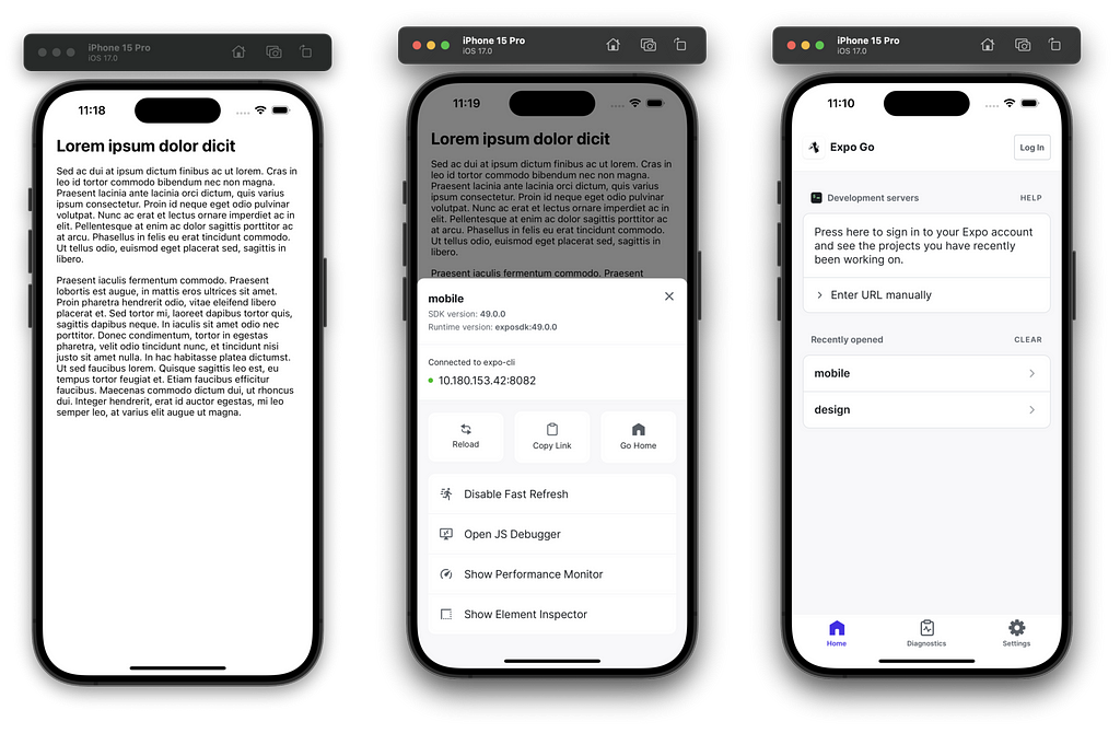
Run yarn start and now, you have two Metro bundlers running in simultaneously: one for Storybook and one for the app.
You can switch between them through the development menu accessible by shaking the simulator (or device).

You’ve made it this far, but feeling too lazy to redo everything step by step? You‘ll find bellow an example of a monorepo on my Github.
I hope you find this interesting and feel free to share your way to use Storybook!
A cleaner approach for Storybook with React Native was originally published in ekino-france on Medium, where people are continuing the conversation by highlighting and responding to this story.

