
Last April, the 2023 edition of KotlinConf took place in Amsterdam, where I had the chance to attend the conference with two fellow Java/Kotlin back-end developers from ekino.
The two-day conference was filled with lots of interesting topics, all of which are available for replay on the official YouTube channel’s playlist. One of the topics that was covered in several talks was Kotlin Multiplatform and Compose.
Kotlin Multiplatform gives you the ability to centralize the common Kotlin code of your application and package it for different targets, making it a powerful tool to easily develop cross-platform projects. Compose Multiplatform, a project based on Kotlin and Jetpack Compose, is specifically designed to help build and share the UI for such projects.
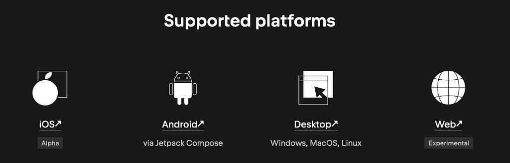
As you can see from their website, there are four platforms available for Compose Multiplatform, each at their own stage of development:
As a back-end developer, one of the use cases that seemed interesting to me was the ability to easily create a desktop application in Kotlin, which could be used on different operating systems.
In his talk, JetBrains developer Victor Kropp described how they use Compose Desktop to develop the Toolbox App :
https://medium.com/media/4249032ba2370f270343cfb643d6cb14/href
Now, let’s see how we could use Kotlin and Compose Desktop on a much smaller scale to create a simple desktop application.
Project setup
Project creation
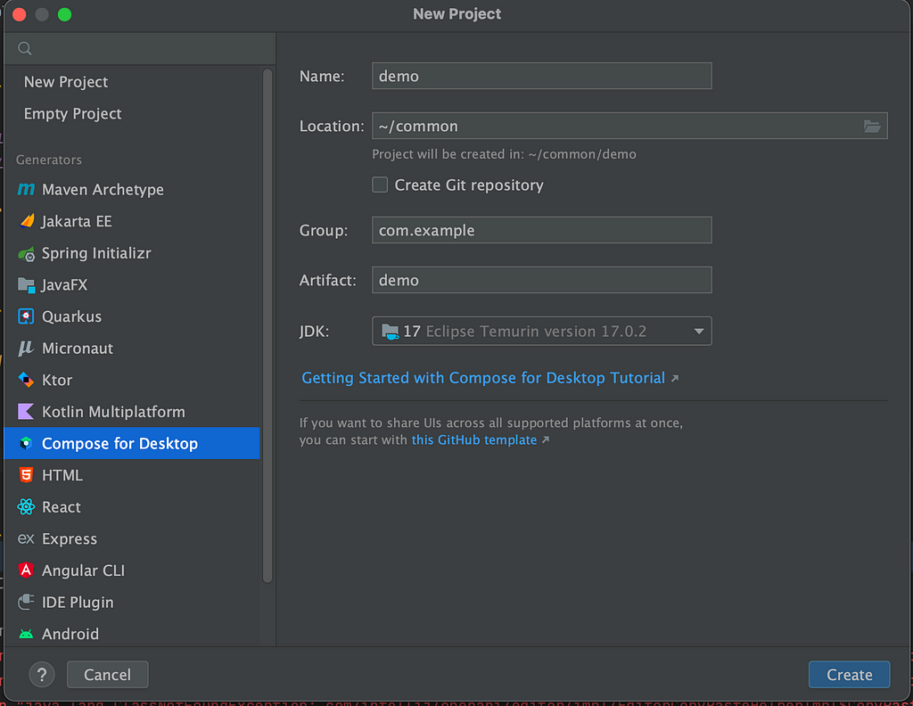
We are going to use IntelliJ IDEA as our IDE. It makes it very easy to start a new project with Compose Desktop.
As usual, you can click on File > New > Project, and then you will see that you can choose the “Compose for Desktop” generator.
Configure your project as you wish, and click on the Create button. This will generate a practical template for your desktop application.
build.gradle
First, let’s see what was generated in the build.gradle.kts file:
import org.jetbrains.compose.desktop.application.dsl.TargetFormat

plugins {
    kotlin("jvm")
    id("org.jetbrains.compose")
}

group = "com.ekino"
version = "1.0-SNAPSHOT"

repositories {
    mavenCentral()
    maven("https://maven.pkg.jetbrains.space/public/p/compose/dev")
    google()
}

dependencies {
    // Note, if you develop a library, you should use compose.desktop.common.
    // compose.desktop.currentOs should be used in launcher-sourceSet
    // (in a separate module for demo project and in testMain).
    // With compose.desktop.common you will also lose @Preview functionality
    implementation(compose.desktop.currentOs)
}

compose.desktop {
    application {
        mainClass = "MainKt"

        nativeDistributions {
            targetFormats(TargetFormat.Dmg, TargetFormat.Msi, TargetFormat.Deb)
            packageName = "compose-desktop-demo"
            packageVersion = "1.0.0"
        }
    }
}
Nothing too fancy in the first part of the file, we are using the Kotlin and compose plugins, along with a dependency on compose desktop.
The application part is where the magic happens, where the final distributions of your application are defined. In this template, we simply have some metadata to describe the application (the package name and version) and the targeted formats (dmg, msi, and deb). Note that other formats are available, such as exe, rpm, or pkg.
Based on the specified formats, the compose Gradle plugin will (amongst other things) create a task to package each type of application. In our example, it will thus create the three following tasks:
- packageDmg
- packageMsi
- packageDeb
Bear in mind that there is currently no cross-compilation support, so you need to build your application on the specific OS required by the format (e.g. you need to be on macOS to build a dmg application, and you need to be on Windows to build an exe application).
You can configure many other things in this application block (including the icon of your application, a very important feature). To learn more about this, you can check out this documentation: Native distributions and local execution.
Main.kt
Let’s now look at the code of our desktop application, located in the Main.kt file.
First, we have a mainfunction:
fun main() = application {
    Window(onCloseRequest = ::exitApplication) {
        App()
    }
}
The application is the entry point to our application. It simply contains a Window – with a property to close everything linked to the app on exit – and inside the Window lies our App.
You can specify certain properties on the Window function to customize the appearance of the main window: the dimensions, title, icon, etc.
Now, let’s look at the App code.
@Composable
@Preview
fun App() {
    ...
}
First, you might notice the @Preview annotation on the App.
This feature gives you the ability to preview the look of your application (or smaller components) in your IDE without running the full application.
To be able to use this feature, you need to get the Compose Multiplatform IDE Support plugin. Once installed, you should see a hexagonal icon on the left gutter. If you click on it, the preview will be rendered on the right side of the window like so:
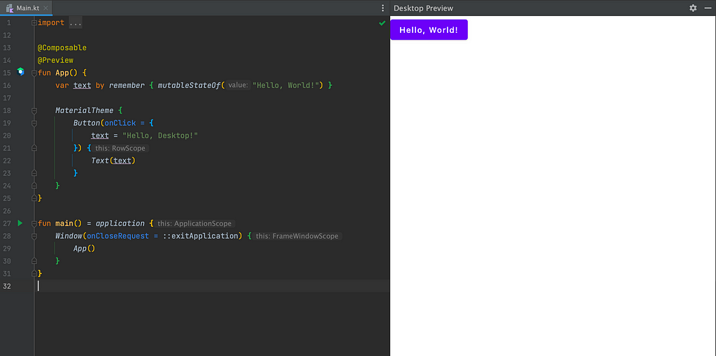
Of course, this is only a preview, so if you click on the “Hello World!” button, it won’t do anything, even if the code says so. However, it can be very useful once you have a larger application, to test the appearance of the smaller components you’ve developed (which you would also annotate with @Preview).
Now, let’s see what this application does by studying the code in the App function:
fun App() {
    var text by remember { mutableStateOf("Hello, World!") }

    MaterialTheme {
        Button(onClick = {
            text = "Hello, Desktop!"
        }) {
            Text(text)
        }
    }
}
If you are familiar with Android application development using Compose, it should look very familiar to you. If you are not (like me), let’s take a look at what it does.
First off, we have a text variable which is defined as follows:
var text by remember { mutableStateOf("Hello, World!") }
The remember delegate is used to store an immutable or mutable object in memory. When the UI is reloaded, a mechanism called recomposition is then used to restore the object.
The mutableStateOf creates an observable with a value. Every time a change is made to this value, it will schedule the recomposition of composable functions observing the value. This is initialized with the “Hello, World!” value.
The UI part is then described as such:
MaterialTheme {
        Button(onClick = {
            text = "Hello, Desktop!"
        }) {
            Text(text)
        }
    }
The MaterialTheme part will let you customize the appearance of your application (colors, typographies, shapes, etc.) as you can see in this documentation. Our version doesn’t redefine anything, so it will use the default settings.
We can then see that there is a single element to our UI: a Button. This button contains a Text with a value equal to our text variable. When the button is clicked, the onClick function should be called, updating the value of the text variable to “Hello, Desktop!”.
Starting the application
Let’s now see if our assumptions as to how this works are correct by launching the application in local.
To do this you can use the Gradle run task. You can find it in the “compose desktop” part if you want to use IntelliJ UI:
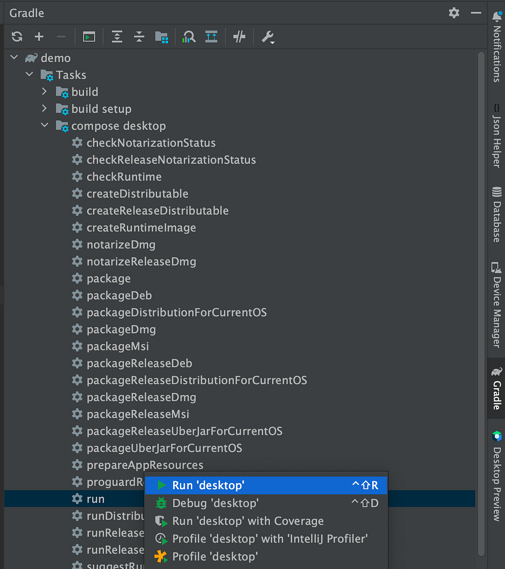
Or you can use the command line:
./gradlew run
This should launch the application and you will see the button with a “Hello, World!” label:
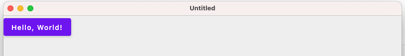
And once you click on it, the label changes to “Hello, Desktop!”:

Congratulations ! you have now run your first desktop application using Kotlin and Compose.
Now, let’s see how we can customize it.
JSON comparator tool
We are going to build a very simple application that compares two JSON texts and highlights the differences between the two.
We will use jsonassert as our comparison tool so you can add it as a dependency in your build.gradle.kts file: org.skyscreamer:jsonassert.
As there will not be too many lines of code, we will only modify the existing App function and not create any other file.
To simplify the code a little, I will remove all the small UI tweaks. However, you can still check out the full code in this repository: compose-desktop-demo.
Here is what we end up with:
@Composable
@Preview
fun App() {
    var result by remember { mutableStateOf("") }
    var json1 by remember { mutableStateOf("") }
    var json2 by remember { mutableStateOf("") }

    MaterialTheme {
        Column {
            Row {
                OutlinedTextField(
                    value = json1,
                    onValueChange = { json1 = it },
                    label = { Text("JSON 1") }
                )
                OutlinedTextField(
                    value = json2,
                    onValueChange = { json2 = it },
                    label = { Text("JSON 2") }
                )
            }
            Row {
                Button(onClick = {
                    result = compareJSON(json1, json2)
                }) {
                    Text("Compare")
                }
            }
            if (result.isNotBlank()) {
                Row {
                    OutlinedTextField(
                        value = result,
                        readOnly = true,
                        onValueChange = {},
                        label = { Text("Result") }
                    )
                }
            }
        }
    }
}
First, we have three string variables: one for each json field and one for the comparison result.
var result by remember { mutableStateOf("") }
var json1 by remember { mutableStateOf("") }
var json2 by remember { mutableStateOf("") }
Then, we can see that it is possible to organize the UI into columns and rows. In our case, we will have one column with three rows:
- the first one containing the two json fields
Row {
    OutlinedTextField(
        value = json1,
        onValueChange = { json1 = it },
        label = { Text("JSON 1") }
    )
    OutlinedTextField(
        value = json2,
        onValueChange = { json2 = it },
        label = { Text("JSON 2") }
    )
}
- then one for the button that will launch the comparison
Row {
    Button(onClick = {
        result = compareJSON(json1, json2)
    }) {
        Text("Compare")
    }
}
- and the last one with the comparison result (displayed only if there is a result)
if (result.isNotBlank()) {
    Row {
        OutlinedTextField(
            value = result,
            readOnly = true,
            onValueChange = {},
            label = { Text("Result") }
        )
    }
}
Here is how the program works:
- the two text fields will update the corresponding variables json1 and json2 when their value changes
- the button works exactly as in the example provided from the previous template project. It will call a function computing the differences between the two JSONs (we will soon take a look at this function) and update the result field
- the last text field will simply display the comparison result
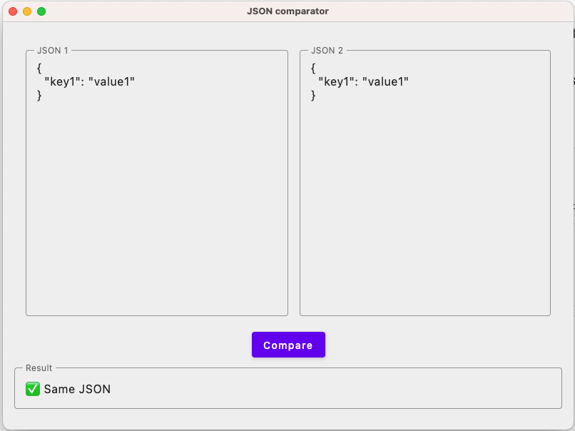
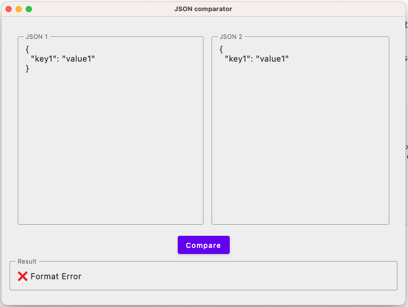
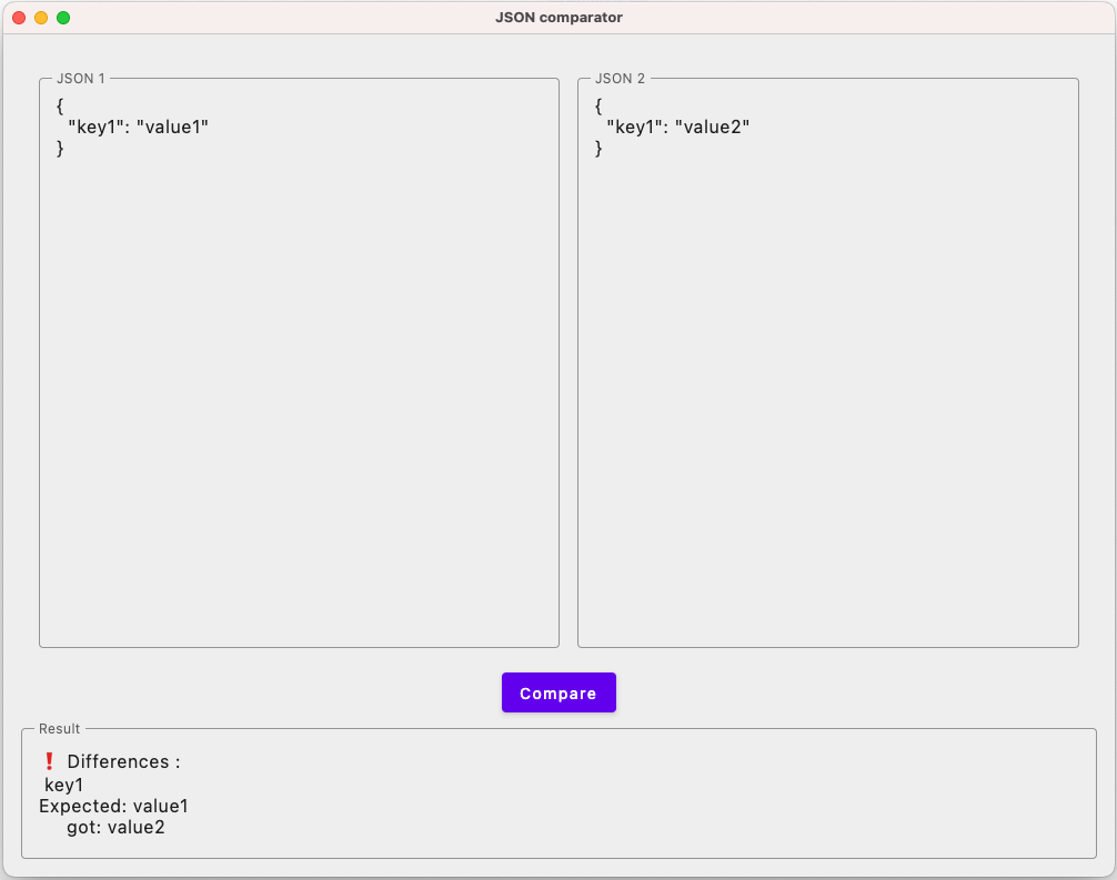
The comparison function will call the jsonassert functionality that compares two JSONs and returns the result. For this first version, we’re displaying the result as it is (with some emojis nonetheless), so it might be a little bit hard to read.
fun compareJSON(json1: String, json2: String): String {
    return try {
        val comparison = JSONCompare.compareJSON(json1, json2, JSONCompareMode.STRICT)
        if (comparison.passed()) "✅ Same JSON" else "❗ Differences :n ${comparison.message}"
    } catch (e: JSONException) {
        "❌ Format Error"
    }
}
The end result, after some minor visual adjustments, goes like this:
What’s next ?
Improving the application itself
With the help of the “Compose for Desktop” project generator and a few simple tweaks, we’ve managed to develop a working and useful application in a short period of time.
But if we are being honest, even if the application works (hopefully), it would be very painful to use it as it is on a daily basis. The comparison messages are not very user-friendly, and even if we were to rewrite them a little, it would still be a hassle to find the matching fields in a long JSON.
So here are a few things that could be improved (in order of personal felt difficulty):
- make the comparison mode configurable: we chose (quite randomly) to use the STRICT mode to compare the two JSON texts. It should be relatively straightforward to incorporate checkboxes on the UI for the different comparison modes and let the user decide
- use another JSON comparison library: for example the jcv library (based on jsonassert) can help you compare two JSONs with custom field validations, making it easy to validate a whole JSON containing fields with unpredictable values but predictable formats (such as “today’s date” or “a random uuid”). It is very convenient and we use it quite a lot at ekino so it could be interesting to use it here
- testing the application: as you may have noticed, there are no tests on this application. This is a shame because there are tools that come with Compose to help you test the UI of your application (you can check the documentation here and see an example on the jetbrains blog)
- prettify the JSON fields: the two JSON input fields look very bland and it can be hard to read. It would be great if we could add some color and reformat the text according to JSON formatting rules (either with a button or synchronized with the input)
- display the differences and potential format errors directly in the JSON input fields. It may not be straightforward and probably requires reordering the fields in the second JSON to match the order of the fields in the first, but it would be much better to display the differences directly on the incriminated fields. Something like the “compare” functionality in IntelliJ but using JSON comparison instead of a “line by line” one.
Packaging the application
You may have noticed that I didn’t explain how to package the application for easy sharing and usage at the end.
The reason behind this, as mentioned in the beginning, is that there is currently no cross-compilation support. In my case, I work on a mac computer, and macOS does not authorize custom applications to be run on your computer. You need to sign and notarize your application to launch it, which is explained here. If you have a Windows computer, however, this should be fairly straightforward.
For this reason, I will not go into the details of packaging in this article. Nonetheless, here are a few recommendations: Configure all the necessary settings in the application sections of the build.gradle.kts file (following this documentation) and use the Gradle package task that is generated. This should create the application file in your build/compose/binaries folder.
Turning it into an IntelliJ plugin
All things considered, if developers really wanted to use a JSON comparison interface, incorporating it directly into their IDE would be considerably more practical than having to open a new application.
The good news is that it is possible to use Compose to build the UI of an IntelliJ plugin. You can check out this example to see how.
Using Kotlin Multiplatform
Kotlin Multiplatform offers a simple method for developing not just desktop applications but also mobile apps that can share a portion of their code. Although personally I don’t find this specific use case relevant — I’ve never felt the need to compare JSON on my mobile phone — but hey, why not?
You can check these sample projects if you want to see how to build applications on desktop, android, and iOS with real-life cases. Just keep in mind that Compose Multiplatform for iOS is still in Alpha.
Furthermore, hosting the application on a web server is also a viable option. Although the web target is still experimental, as mentioned at the beginning of the article, it holds a lot of potential and could allow you to reach more users than a desktop application.
About ekino
For more than 10 years, ekino has been a trusted partner of major groups and start-ups, supporting them in their digital transformation journey. With a team of 600 passionate experts in consulting, data, design, engineering, development, and UX, we pioneer a holistic approach that integrates each discipline’s unique value.
To find out more, visit our website — ekino.com.
Building your first desktop application in Kotlin with Compose desktop was originally published in ekino-france on Medium, where people are continuing the conversation by highlighting and responding to this story.