“Together”, a data artwork diving into the bowels of a global organization
Kirell Benzi, Head of Research at ekino and data artist was interested in the organization chart of the Havas network to create a data art work: "Together".
“The only thing that is constant is change”
-
«The only thing that is constant is change »
Today in the business world, we talk about change. The advent of AI is transforming our entire society. Tech companies heavily invest in R&D to stay on top of the game while older industries are trying to catch up on their digital transformation.
I was always intrigued by having a tangible representation of the different entities of the company as it would surely reveal interesting insights on how it is managed.
As you would imagine, few corporations were willing to let me access their organizational chart under my own data art studio Kirelion. As soon as I joined l’Atelier d’ekino (ekino’s innovation department), I was fortunate enough to be able to work on this idea and to apply it to our parent group: Havas.
Spoiler: it turns out that the knowledge extracted from this analysis is extremely valuable and can drastically help to make informed data-drive.
An idea is worthless without execution
Paraphrasing a common saying in the startup world, having an idea is great but until you can make it happen, it is just an idea.
In our case, to execute this idea, I first needed to get my hands dirty and collect data about the Organizational chart of the group.
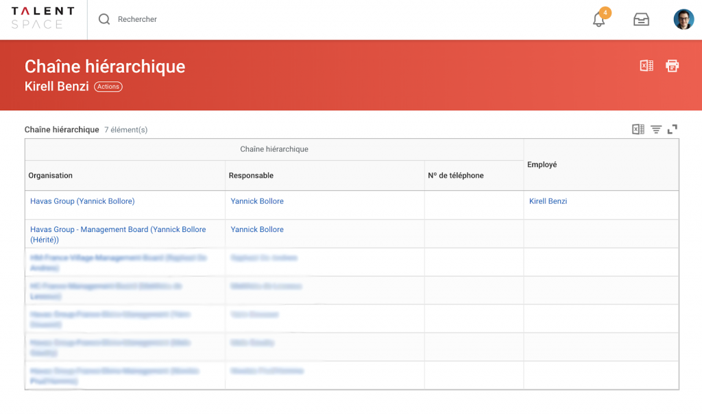
Fortunately, Havas recently migrated to WorkDay, an ERP for finance/HR in order to simplify and rationalize within the group. This named TalentSpace acts as an internal LinkedIn where people can expose their talents and background. On top of that the tool provides their title, physical location, company name, ways of reaching them and their boss.
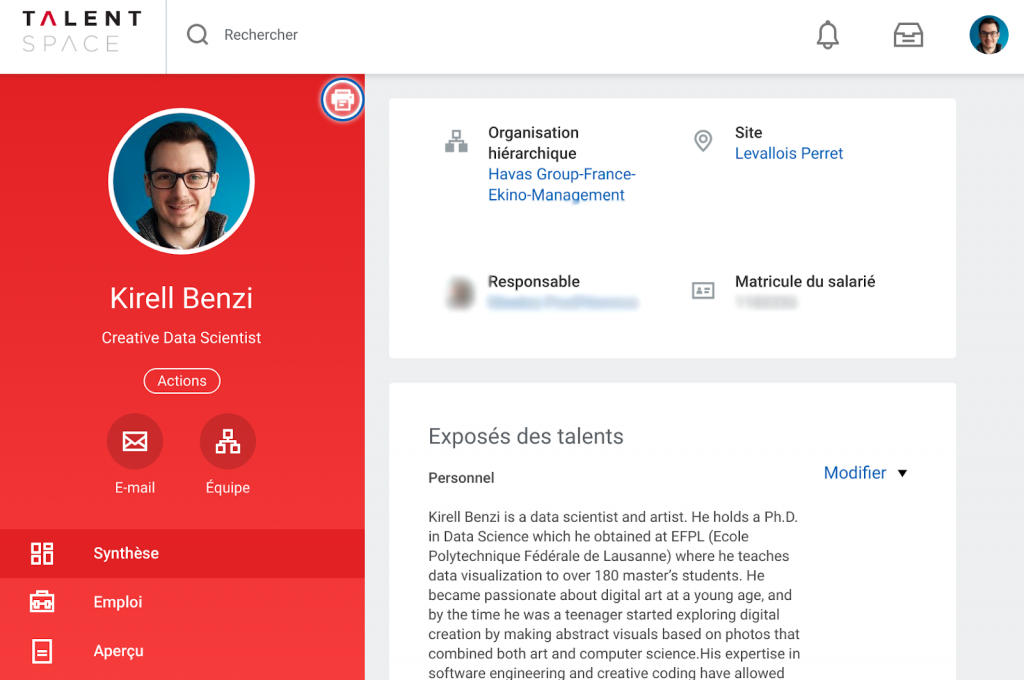
For those who may fear leakage of private info, rest assured that as a regular employee, I could only access anonymized GDPR-compliant (no names) information with the consent of the HR department. Note that when I started working on the project not all the subsidies had migrated to the platform (hence the lower number of data points).
As with all new data-driven projects, I started by agglomerating information. One point worth noticing is the gender balance of the organization with more women in all 4 branches of the group.
The distribution of managers is slightly in favor of men in the top-management with a turning point at level 4, 0 being the CEO Yannick Bolloré. This level 4 roughly corresponds to the executive committee of each individual digital agency that the group manages.

Of course, there is much more to be shown that I can’t share here such as the distribution of job titles, the number of managers per agencies and at which level, the subsidies’ location of each agency and how they interact for instance.
When you start adding the job title in the mix, you can also anticipate the shortage/recruitment of talents you need to recruit to achieve your strategic goals.
This is just a bunch of examples but as you can imagine, it is extremely valuable and actionable info when your job is to manage and have a strategic vision of a company.
From data visualization to data art
Visualizing the hierarchy
So far we have talked about the value of collecting organizational info on a company. Let’s remember that we extracted a network connecting all employees to their direct superior.
As you know, this simple one-to-one relationship does not necessarily reflect the real chain of command but it is already a good start to build a visualization.
Here is an attempt at revealing the hierarchical levels of the group using a radial tree layout.
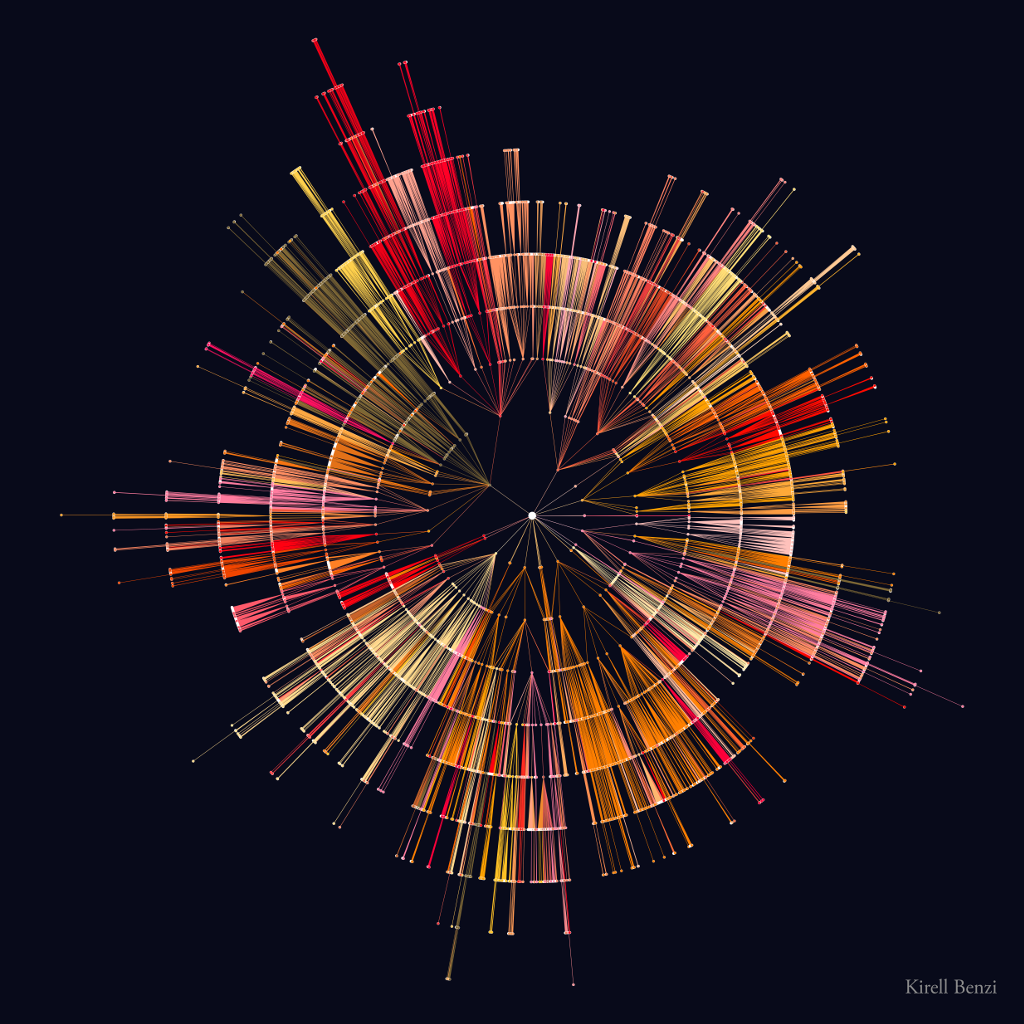
The dataset is too complex to be able to visualize all its dimensions in a 2D representation. As a general rule in a network visualization, proximity on the image does not necessarily imply proximity in the data.
In our previous radial tree, we can clearly see the different hierarchical layers, but we miss a sense of quantity. Indeed, most nodes are drawn almost on top of each other, making it difficult to assess the volume of employees per branch.
When data viz is not enough
To solve this problem, we have basically two options: adding a companion data visualization (like the barchart on top) to indicate the volume per branch or per sub company or improve/modify our radial tree layout.
First, instead of having a circular shape we could put everything in line like a file system folder view. The problem with this one is that the list becomes very long and boring to look at: you probably need to scroll to see it correctly or unzoom it so far you won’t see anything.
Coming back to our radial chart, we also put more nodes on each line with no overlap and unzoom even further away. The issue in this case, as with all angle-based visualizations, is that the human visual system has a hard time evaluating angles precisely and thus difficulty counting the number of employees. For the curious reader and avid data viz designer, this observation led to the famous blog post: “Death to Pie charts”.
This problem is also the perfect opportunity to get creative in the data viz itself and gradually enter the realm of data art. Because it is already a compromise between different visual features, we could as well introduce aesthetics and emotions in the mix!
To iterate over a design, the data viz practitioner must ask him/herself questions that criticize the current implementation. For instance:
- How would the audience judge its interpretability compared to the previous one?
- Is the color palette appropriate for the data at hand?
- Is the data-ink ratio adequate?
- Does it look more emotionally engaging, if so why?
On top of that, other artistic concerns must be addressed such as:
- What is the concept behind this piece?
- Is there a sense of harmony, symmetry in it?
- How does it compare to previous pieces, too much similar? Coherent with the series?
- Is the shape supposed to be figurative or totally abstract?
- Do the colors resonate with the tone and idea behind the piece?
Data art to the rescue

These questions led me to create this “fuzzy” radial tree.
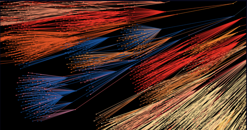
While it is harder to count the number of layers, we have a better sense of the total number of employees. If you are interested in the technical details, it was created by using the previous radial tree and by applying a bit of a force-directed layout to it.
“Art is never finished, only abandoned.”
-
« Art is never finished, only abandoned »
Once I “finished” this fuzzy radial data artwork, I put it as my wallpaper and moved on to other projects for a few months. I knew it was not in its final stage, yet I had no idea how to drastically improve it.
Improving one aspect, such as visual compactness, would make a regression in another, like the interpretability for instance. In addition, I was so used to see a circular representation for these types of datasets that I had a hard time imagining something else.
I had to start fresh, a blank slate so to say, to be able to come up with something new.
Breaking the circle of death
If you are used to working with graph datasets, you know that most layout algorithms have a tendency to create circular-like shapes. It comes from the fact that they try to minimize the distance from the center of mass of the network without overlapping too much.
In layman’s terms, it means that most mathematical formula researchers use to draw networks on screen are based on the same physics model and that it often yields a circular shape.
Despite my love for these circular shapes, I wanted to create something radically different and kickstart creativity without doing a ring.
My first tries were leaning towards isometric shapes, but being a 2D artwork (to be printed) introducing a false sense of perspective didn’t really work for me here. I gradually came up to this triangular shape that I find compelling because it is so unusual in the network visualization world. It clearly shows each individual employee of the group, organized into each sub organization as we had before.
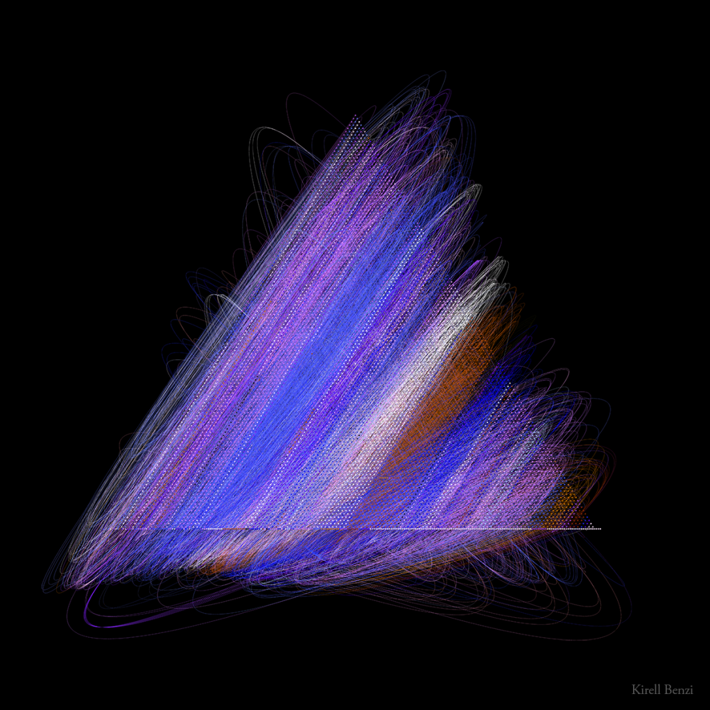
Despite my enthusiasm for the previous triangular shape, I realized that it occluded the hierarchical nature of the network too much. I will keep this idea for a future piece where it really makes sense, here I clearly needed to go back to showing the links albeit more poetically…
“Together”
After countless other iterations and refinements, I am happy to present the final version of the data artwork: “Together”. I hope that you find it visually engaging, not to say beautiful, and that it resonates within you as it did with me.
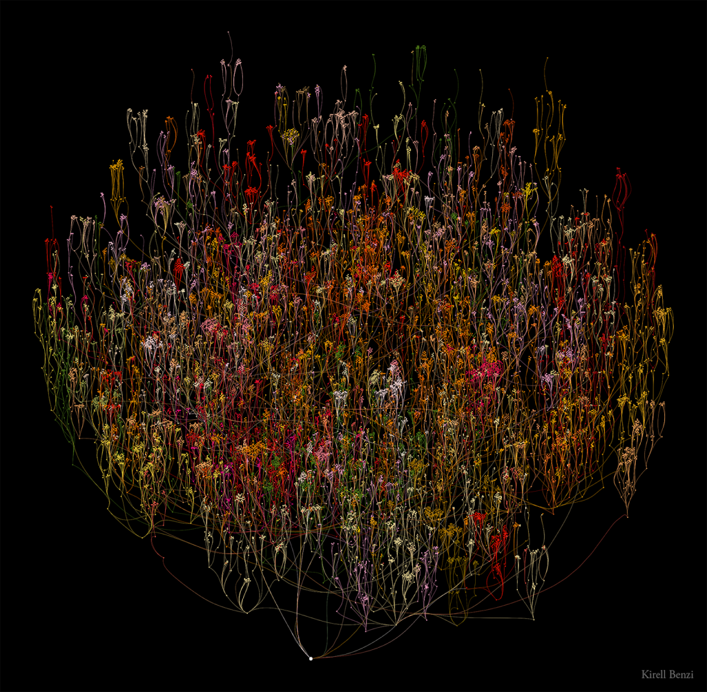
The Havas group is one of the top leading communication groups in the world with a presence in more than 100 countries. In other words, the CEO is linked to his executive committee, the CXOs, who in turn are linked to their subordinates in each branch, and so forth. This particular network thus starts from the top management to the lowest entry position within the group.
Final words
I hope that this article shed some light around the process behind the creation of a data artwork and the value behind this novel integrated approach: from data to visualization to art.
As we saw, the ability to analyze internal organisational chart data proves to be extremely valuable for the top management, shareholders as well as human resources.
More generally, the brand image is one of the most valuable assets of a company both for its clients and employees. Departing from classical marketing schemes, data art adds a unique perspective on branding, mixing emotions and cognition altogether, as we expose the essence of the company in one artwork.
Contact
Curious about what your dataset would look like as data art or as interactive data visualization?
Contactez-nousLire plus d’articles
-
8 Minutes read
3 questions au Docteur Kirell Benzi, creative data scientist chez ekino
Lire la suite -

8 Minutes read
Interview du Dr Kirell Benzi, intervenant à la Data Visualization Society le 16 juillet prochain
Lire la suite

